.png)
Simply Inspired Events
Case Study
Simply Inspired Events is a conceptual brand I created to showcase my design and branding process. From the initial idea to the final visuals, I developed the name, mission, audience, and cohesive brand identity. This case study highlights my ability to independently research, plan, and design a polished event brand from scratch, demonstrating creativity, intentionality, and design strategy.
.png)
Background
Background:
Planning personal events can be both exciting and overwhelming. People often struggle to keep track of guest lists, manage timelines, and organize vendors while trying to stay inspired and creative. With the rise of digital tools, there is an increasing demand for platforms that simplify event planning, provide inspiration, and centralize all necessary resources.
Problem Statement:
Many existing event planning tools are either too complex or lack visual inspiration, leaving users frustrated and disorganized. There is a need or a platform that balances functionality with ease of use, helping users efficiently plan their events while feeling confident and inspired throughout the process.
Research
Research Goal:
Learn the key challenges and needs of women planning private events so that we can design a tool or service that simplifies the planning process and improves their overall experience.
Research Objectives:
-
Determine the main challenges women face when planning private events.
-
Understand the goals and priorities of users during the event planning process.
-
Learn how current tools and methods are used and where they fall short.
Methodologies:
-
User interviews with 5-8 women who have planned for or are currently planning private events. Interviews were remote or one-on-one to help understand their thought process, challenges, and emotional experiences in depth. Interviews lasted 20-30 minutes.
-
Competitive analysis to review existing tools and platforms to learn that features users currently rely on, what is missing, and how our potential solution can stand out.
Competitive Analysis
The Knot
Wedding-focused planning tools and RSVP tracking
RSVPify
Custom online RSVPs and guest management
Community platform with easy access to contacts
Opportunity
A simple, all-in-one platform for planning, RSVPs, and inspiration across all event types.

Research Summary
Needs:
-
Tools that simplify planning and keep everything organized
-
Clear, actionable guidance for each step of the planning process
-
Easy ways to manage guests, tasks, and vendors
Motivations:
-
Desire to host successful, memorable events with minimal stress
-
Wanting to save time and avoid mistakes in the planning process
-
Interest in personalization to make events feel unique and meaningful
Pain Points:
-
Overwhelmed by too many tasks or scattered information
-
Difficulty tracking vendors, RSVPs, and timelines
-
Frustration with inflexible tools or lack of clear guidance
.png)
Synthesis (User Interviews)
Through on-on-one interviews with potential users, we gained a deeper understanding of their needs, motivations, and pain points when planning events. The insight helped guide the design direction, ensuring solutions are intuitive, relevant, and aligned with real user behavior.
POVs & HMWs
POV 1 - Planners who rely on multiple disconnected tools need a centralized way to organize budgets, RSVPs, and tasks because juggling across platforms creates confusion and wasted time.
-
How might we create an all-in-one planning hub that reduces the need for juggling mutliple tools?
-
How might we design a lightweight system that adapts to different event types without overwhelming the planner?
POV 2 - Planners who work with tight budgets need help balancing cost and quality because the cheapest option is not always reliable, but overspending isn’t realistic.
-
How might we create transparent vendor comparisons to show trade-offs between price and quality.
POV 3 - Planners who start early and prepare in chunks need tools that reinforce timelines because last-minute changes are overwhelming without structured checkpoints.
-
How might we design tools that encourage early preparation and milestone tracking?
-
How might we nudge planners with reminders and progress check-ins to keep momentum?
User Personas
.png)
.png)
Project Goals
.png)
Site Map & Key Task Flows
.png)
.png)
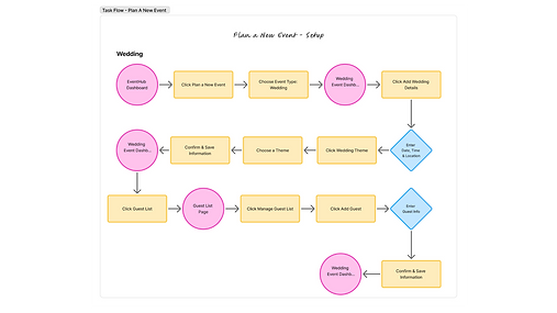.png)
Mid-Fidelity Wireframes
.png)
Mid-Fidelity Wireframe 1 –
Home Page (First Visit)
This screen introduces new users to the product with a clean hero section and a strong call-to-action to get started. Below, a simple three-step overview explains how the platform works, helping users quickly understand the process before exploring further.
Mid-Fidelity Wireframe 2 –
Returning User Dashboard
This screen greets returning users and allows them to quickly resume planning a current event or start a new one. It highlights upcoming events and includes personalized recommendations based on the user’s event details, helping them discover relevant vendors, ideas, and actions.
.png)
_edited.png)
Mid-Fidelity Wireframe 3 –
Event Planning Dashboard
This screen gives users an at-a-glance view of their specific event details. Key elements such as budget, vendors, and guest list are highlighted for quick reference, along with a task timeline that surfaces upcoming deadlines. This central hub helps users stay organized and on track throughout the planning process.
Mid-Fidelity Wireframe 4 –
Guest List Management
This screen provides an overview of guest RSVPs, including confirmed, pending, and declined responses. Users can review the full list of invited guests, search for existing entries, or add new guests, making it easy to manage invitations in one place.
_edited.png)
Brand System
Core Values: easy to use, inspiring, memorable, creative, and personal.
.png)
.png)
.png)
UI Component Library
.png)
.png)
Hi-Fidelity Prototypes
.png)
Hi-Fidelity Design 1 –
Home Page (First Visit)
This hi-fidelity home screen welcomes new users who have not yet created an event. The layout introduces the platform’s visual identity with clean typography, balanced spacing, and a friendly onboarding message. A prominent call-to-action invites users to “Start Planning,” supported by subtle illustration and branded accents to make the experience approachable. Clear navigation and a simplified hero section help users understand where to begin, ensuring that their first interaction with the platform feels purposeful and intuitive.
Hi-Fidelity Design 2 –
Returning User Dashboard
This hi-fidelity dashboard is designed for returning users who already have an event in progress. It delivers a personalized overview of their planning status with polished UI components and a clear visual hierarchy. Key sections, such as Upcoming Events, are presented in refined cards for quick scanning. A section also highlights suggestions for the user based on where there are at in their planning process. The design emphasizes clarity, organization, and efficiency, enabling users to jump back into planning with confidence and minimal friction.
.png)
.png)
Hi-Fidelity Design 3 –
Event Planning Dashboard
This hi-fidelity screen represents the full event planning dashboard for a user actively working on their event. It showcases a complete, visually polished workspace where all core planning tools come together. Key areas such as Event Highlights, Budget Tracking, Vendor Management, Guest List, and Task Timeline are organized into refined, interactive card components for seamless navigation. Color-coded indicators, updated iconography, and structured layouts help users quickly understand progress and upcoming deadlines. The design focuses on clarity and efficiency, giving planners a centralized hub to manage every detail of their event with ease.
Hi-Fidelity Design 4 –
Guest List Management
This hi-fidelity guest list screen provides a structured and intuitive interface for managing all invited guests. It features a clean, card-based list layout with color-coded RSVP statuses (confirmed, declined, pending) for quick visual scanning. A prominent search bar and “Add Guest” action make it easy for users to update or expand their list. Each guest entry is designed with clear typography, and spacing to enhance readability. The layout balances functionality and aesthetics, helping planners stay organized and informed as they track attendance and finalize event details.
.png)
Usability Test
Results:
The results were positive. Task completion was 100% across all three tasks. The overall impression was that the experience was clear, easy to use, and consistent. Several participants mentioned that they enjoyed how simple and “clean” the process felt.
What Worked:
Tasks were logical and straightforward. Participants noted that button labels and page layouts were easy to understand. They were also able to apply the same logic used on one function throughout the design.
Prioritized Changes:
Adjusted vertical spacing on home pages and dashboard, made consistent formatting changes to titles, added a home page for existing users that are returning to plan, rearranged cards to make most prominent show first, changed guest status to look less like buttons.
.png)
.png)